Introduction
In B2B industries, companies often deal with complex products and services that can be challenging to explain on a website. Whether it's technical specifications, industry-specific solutions, or custom services, potential clients need to understand exactly what's being offered before they make any decisions. But how do you make this information clear, without overwhelming users with too much detail? The answer lies in minimalist website design.
So, let's explore how minimalism can simplify B2B content while boosting your website's conversion rate.
Highlights:
Tackling the Complexity of B2B Information
Unlike B2C websites that focus on products people can understand quickly, B2B sites often deal with more intricate, multi-layered information. Whether you're selling software solutions, manufacturing equipment, or providing professional services, there are usually more details that need to be communicated.
A minimalist web design focuses on clarity, simplicity, and removing unnecessary clutter. For the B2B industry, this approach helps streamline complex information and reduces the cognitive load on users, leading to better engagement and higher conversion rates.
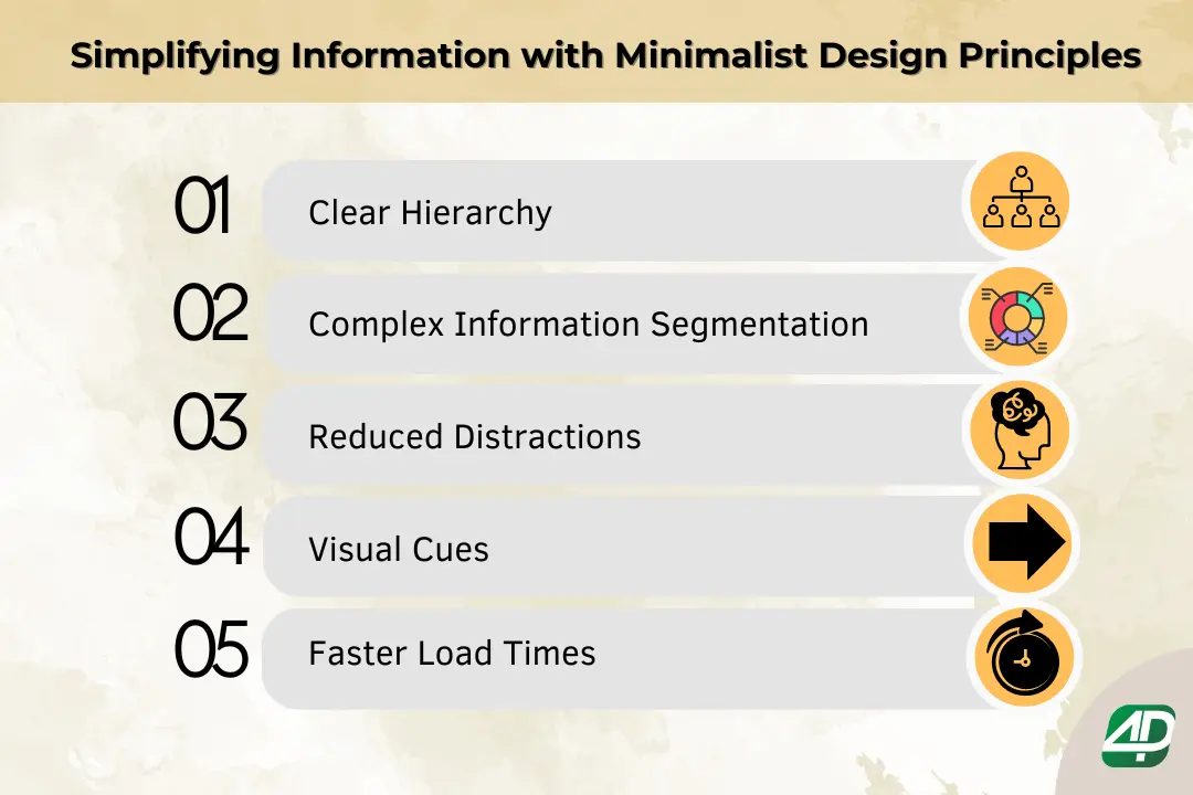
Simplifying Information with Minimalist Design Principles
This section delves into the minimalist website concepts to help your brand appear more professional. By following these essential design elements, you can ensure that your B2B website is not only visually appealing but also efficient.

1. Clear Hierarchy :
A minimalist design makes excellent use of hierarchy to guide users through the site. By structuring content logically and using white space effectively, visitors are directed to the most important sections without feeling overwhelmed. This improves information architecture and enhances the digital user experience.
For B2B sites, this is key—clients should be able to easily find your product descriptions, solutions, or services without having to sift through excessive details. This clarity keeps users on the page longer and pushes them toward taking action.
2. Complex Information Segmentation :
Breaking down complex information into smaller, digestible chunks is another advantage of minimalist design. Instead of cramming all the details into long paragraphs, minimalist B2B websites make use of bullet points, short sections, or collapsible menus. The segmentation allows users to access the information they're most interested in without wading through irrelevant content.
For example, if you're showcasing a technical product, you might include an overview at the top, followed by more in-depth specifications in expandable tabs. This way, visitors can explore details at their own pace, improving user engagement.
3. Reduced Distractions :
Too many visuals, pop-ups, or over-designed elements can distract from the key message you're trying to deliver. Minimalism strips away these distractions, as it prioritizes what's necessary.
By having fewer elements on the page, such as a single call-to-action (CTA) or a clean navigation bar, users are more likely to stay focused on the content that matters—whether it's filling out a form, signing up for a demo, or reading case studies. A focused user is far more likely to convert while also keeping your design aligned with best practices for B2B digital marketing.
4. Visual Cues :
The minimalist design also relies on visual cues like color contrasts or icons to emphasize crucial information.
For B2B websites, this could mean using bold fonts or buttons to draw attention to the primary CTA or employing icons to summarize complex concepts. The visual appeal helps guide visitors toward the actions you want them to take without bombarding them with unnecessary clutter, thereby supporting B2B lead generation and conversion rate optimization.
5. Faster Load Times :
In today's digital landscape, fast-loading and mobile optimization websites are non-negotiable. A minimalist design typically speeds up load times on distinct screen sizes because it has fewer elements, images, and scripts.
Additionally, about 20–35% of visits to B2B websites come from mobile devices. A clean and straightforward layout translates well to mobile screens, where responsive design is key to ensuring a smooth digital user experience.
How The 4P Solutions Can Help You with a Minimalist Website?
At The 4P Solutions, we specialize in crafting sleek, user-centric websites that focus on functionality without compromising design. As a leading B2B website design company in Mumbai, we deliver cutting-edge solutions tailored to your business needs.
Here's how our B2B digital marketing agency can help:
-
Clutter-Free Design:
- We create clean, minimalist layouts that prioritize clarity and usability, ensuring your complex information is easy to digest. User-Friendly Navigation:
- Our B2B marketing agency prioritizes simplified site architecture to enhance user experience, making it effortless for visitors to find what they need. Responsive Across Devices:
- With thorough understanding of B2B marketing funnel, our websites are optimized for seamless viewing on mobile, tablets, and desktops, ensuring accessibility anytime, anywhere. SEO-Optimized Structure:
- We implement search-friendly designs and integrate B2B content marketing to boost visibility and drive organic traffic. Faster Load Times:
- With fewer elements, our minimalist websites load quickly, reducing bounce rates and improving conversions.
For more information regarding our B2B website design services, reach out to us at mktg@the4psolutions.com or give us a call at +91 89286 09451
Conclusion
When users experience a frictionless, simple interface, it fosters trust in your brand. Minimalist, effective website design helps project a sense of professionalism and efficiency, which is especially important in B2B contexts where decision-makers need to trust that your company can handle their complex needs. This trust can be a major factor in converting site visitors into long-term clients.
FAQs
You can test your minimalist website's effectiveness by running A/B tests, gathering user feedback, and analyzing engagement and conversion data. This way, you can see which design elements resonate best with visitors.
Assess key metrics like conversion rates, bounce rates, average session duration, and user feedback. These will give you a solid understanding of how well your minimalist design is performing.
It's important to update your website regularly to keep the content fresh and responsive to user feedback. Continuous update and optimization ensure that your design stays relevant to your audience's changing needs.
You can integrate your branding by using elements like consistent color palettes, logos, and typography. These factors help maintain your brand identity while keeping the design clean and uncluttered.

